LifeStraw.com Optimization
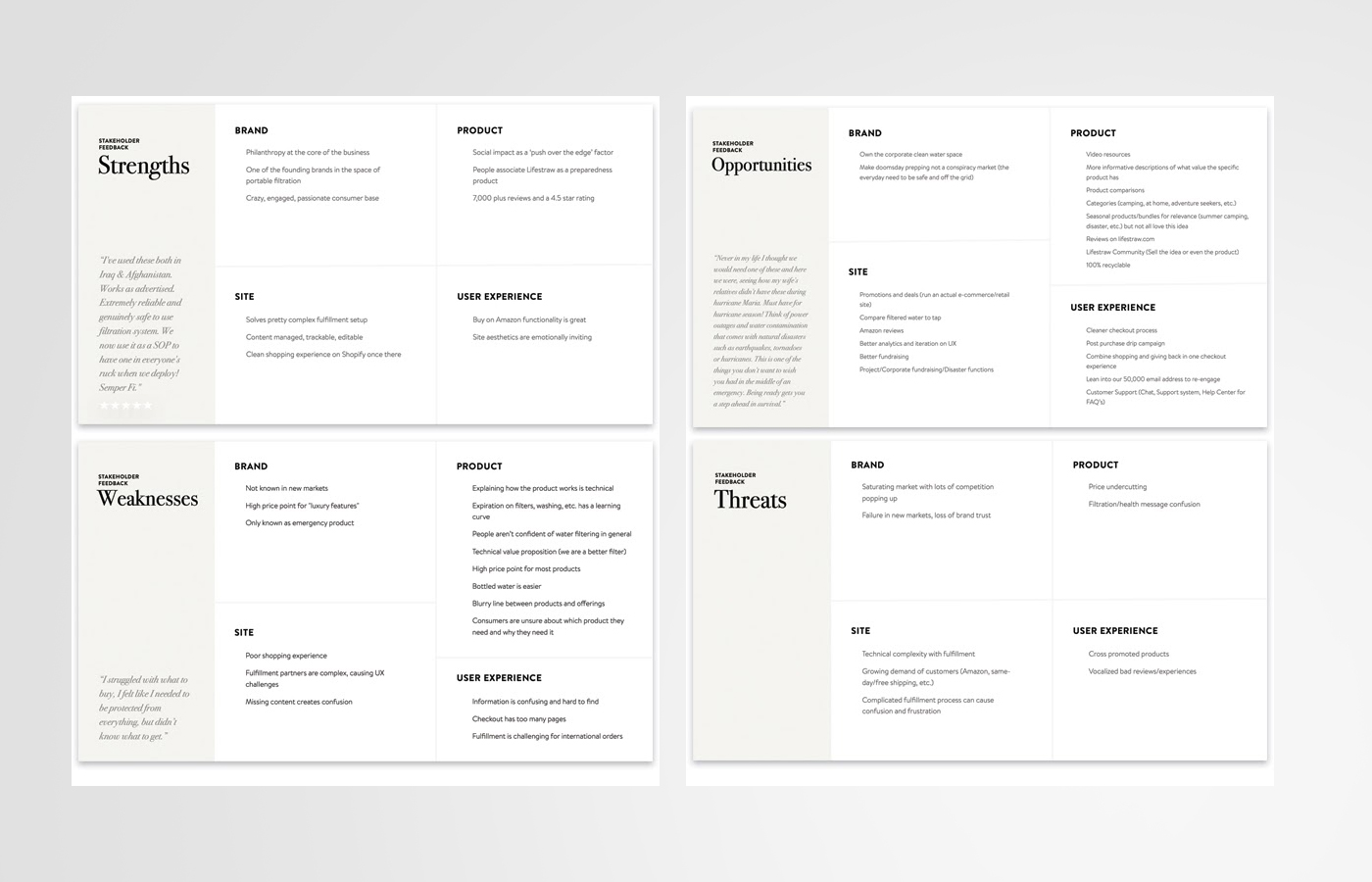
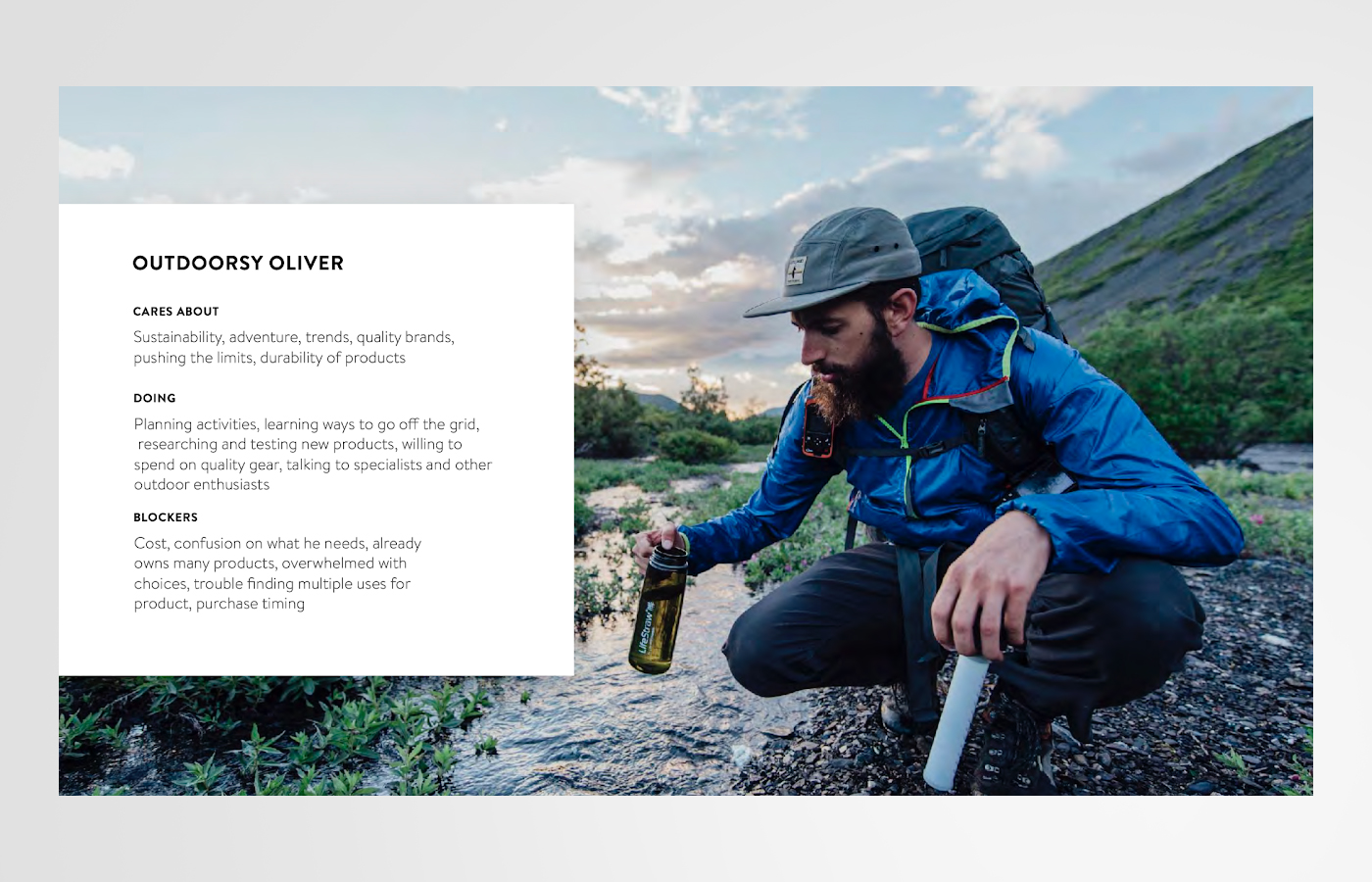
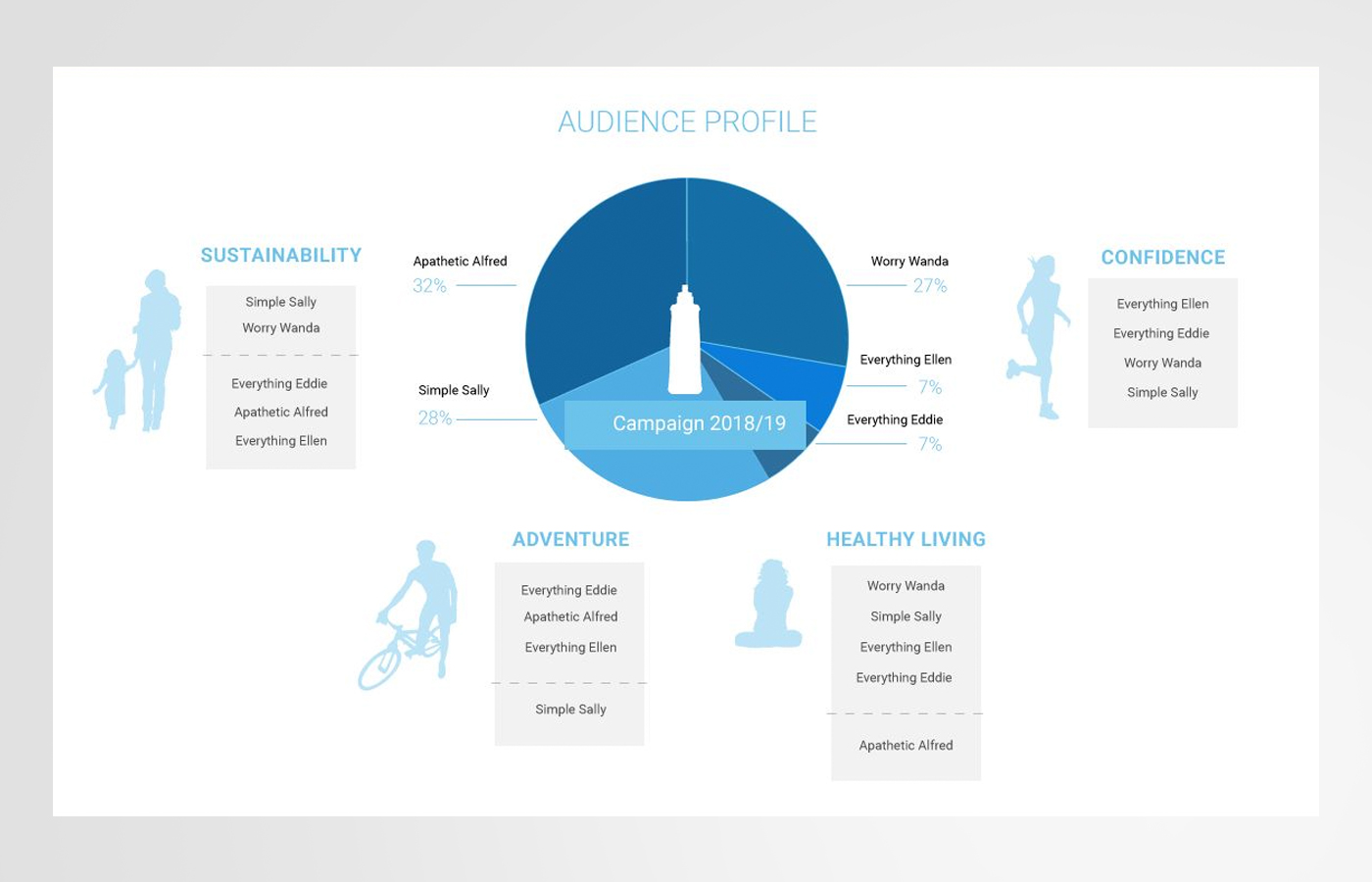
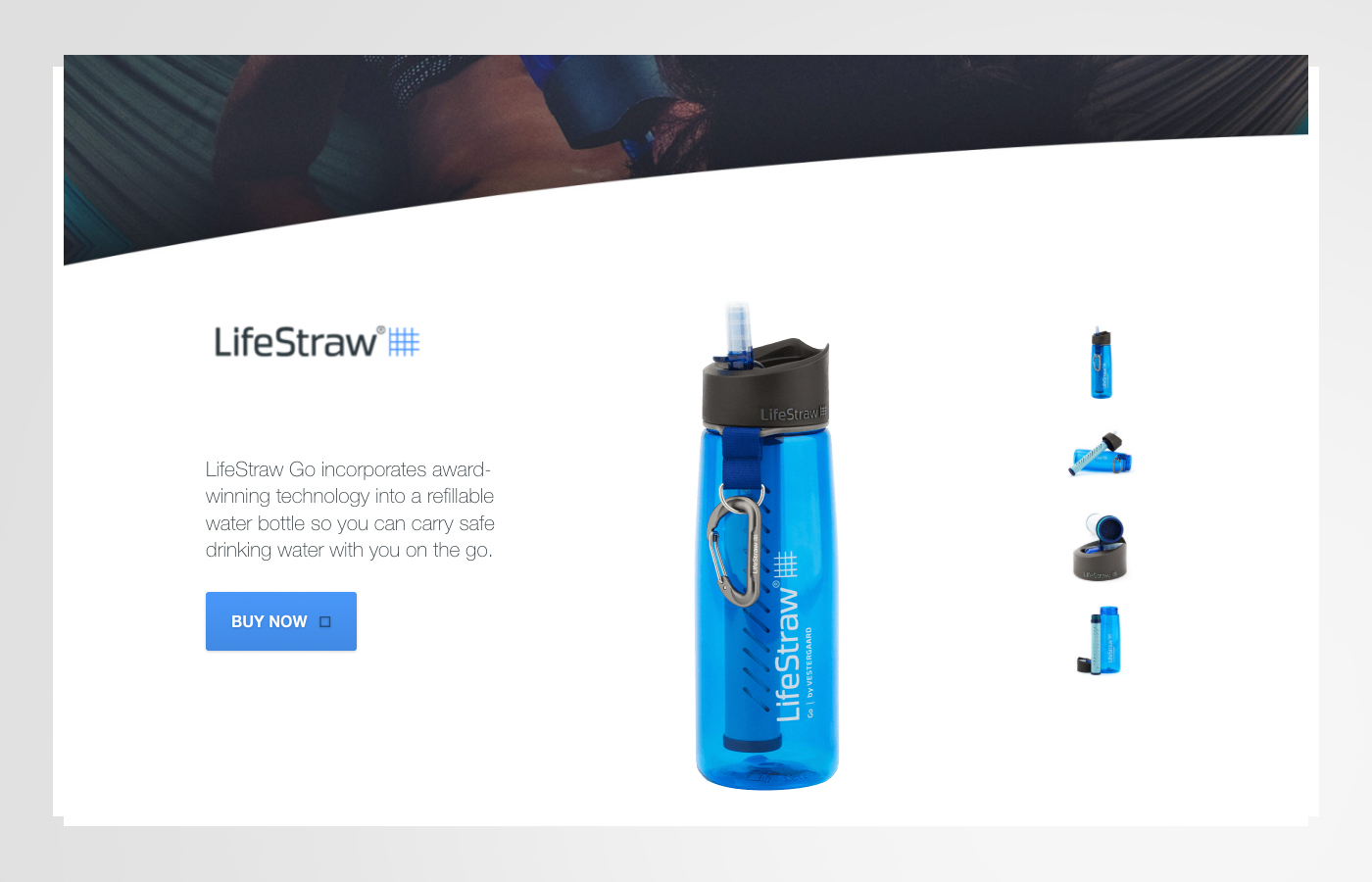
UX research and site strategy to grow e-commerce + retail conversionLifeStraw needed a clearer, higher-converting website experience that supported both direct-to-consumer sales and retail demand. My work focused on improving paths to product information, helping customers select the right product for their needs, and strengthening the customer service experience—while addressing common product concerns and prioritizing sales leads.