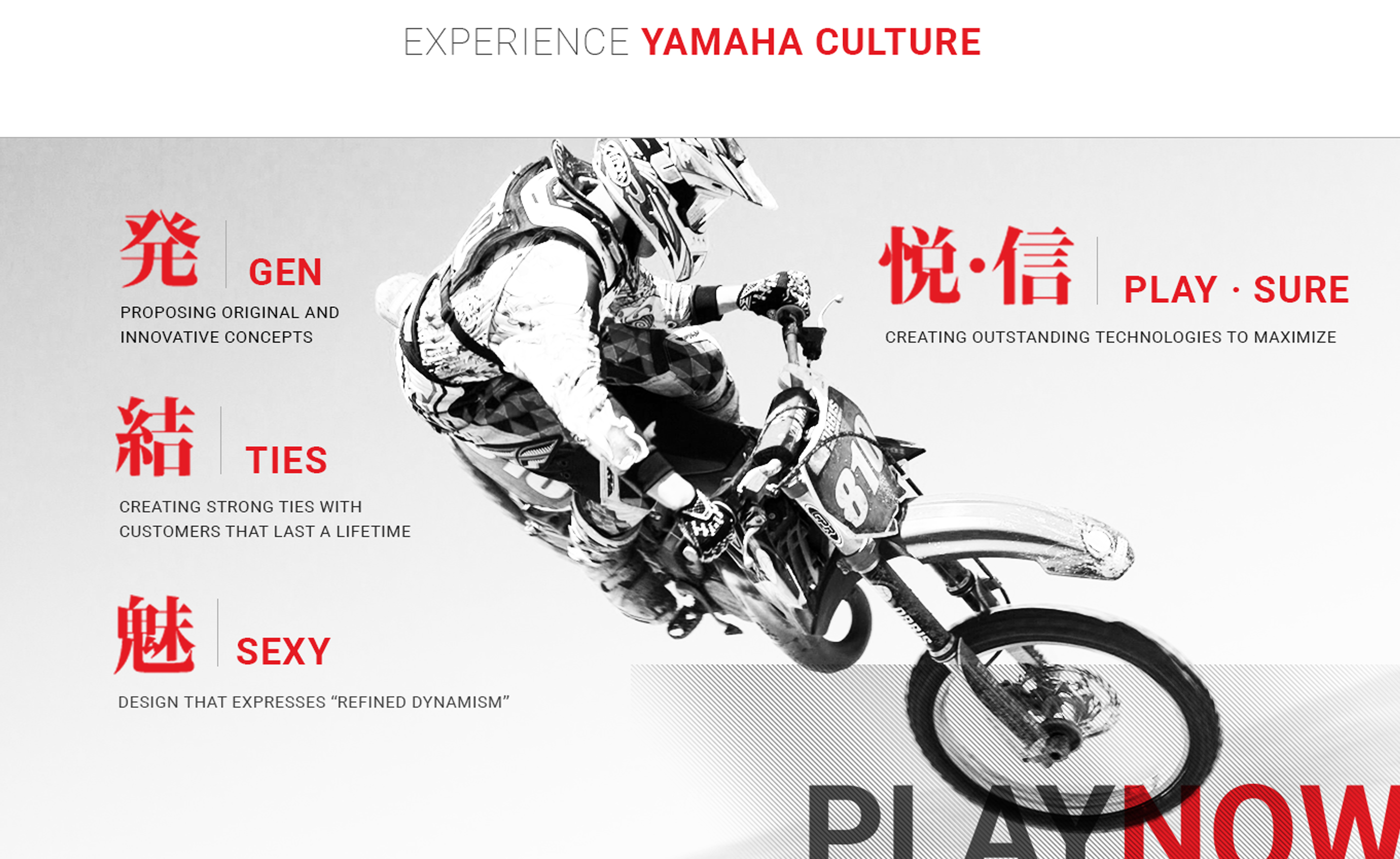
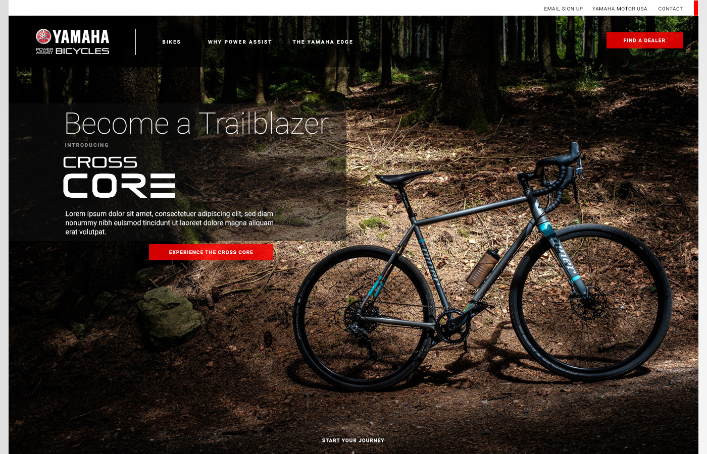
Yamaha Power Assist Bicycles

Helping launch Yamaha eBikes in the U.S. with a content-led, dealer-friendly digital experience
Role: Lead UX / UI Designer (launch support) Scope: Personas, user flows, UX/UI components, page system Timeline: Launch window support (multi-workstream) Audience: New eBike shoppers, enthusiasts, dealer network

Yamaha’s Power Assist Bicycles launch in the U.S. needed more than a product page — it needed clarity. Most buyers were still learning what “assist” means, what to compare, and where to buy. I designed an education-first experience system: clean landing hierarchy, modular content units, and a path that moves customers from curiosity → confidence → dealer visit.

Yamaha eBike launch experience mocks

Designing the “education → trust → purchase” journey for a dealer-led launch.

Launching a new category means answering questions before the customer has to ask them. The experience emphasized big visual units, simple navigation, and clear calls-to-action — while creating space for brand story, product stories, and conversion moments like dealer locator.

01

Built a modular landing system

Designed a full-width, visual-first layout with replaceable “tile” modules so Yamaha could adjust messaging by season, model, or audience without redesigning the entire page.

02

Mapped content to real rider personas

Structured the experience around what different riders care about: brand trust and comfort, commuter practicality, couple-friendly validation, and enthusiast-level spec confidence.

03

Designed conversion around dealers

In a dealer-led purchase model, “where do I buy this?” is a primary CTA. The dealer locator experience needed to feel fast, obvious, and credible — not buried.

Landing / culture story experience
01 / Launch Experience — Visual-first narrative + CTA hierarchy
Brand story page
02 / Brand Story — Trust and credibility scaffolding
Company history page
03 / Company — Heritage as confidence for premium purchase
Dealer locator map and list view
04 / Dealer Locator — Primary conversion endpoint
News and updates page
05 / News — Momentum and freshness signals
Portal / system screen
06 / Supporting Screens — System UI patterns used across experiences

A site that answers the right questions — fast.

I approached the launch as a guided discovery journey: clear navigation, large visual storytelling units, and a structure that helps riders understand assist bikes without feeling like a spec sheet. The experience deliberately bridged brand confidence (heritage + story) with practical conversion (dealer locator).

Key constraints
  • Educating a market still learning the category
  • Dealer-led conversion (not direct-to-consumer)
  • Multiple audience types (commuter / enthusiast / lifestyle)
  • Launch window timing + parallel workstreams
  • High visual standards + brand consistency
Key outcomes

The work prioritized clarity, trust, and conversion in a dealer-based purchase model — helping Yamaha introduce Power Assist Bicycles as a premium, legitimate category in the U.S.

Launch-ready system

Created a reusable page and content framework (global nav + modular units) that supports ongoing updates without breaking layout or CTA hierarchy.

Dealer conversion

Positioned dealer locator as a primary path — treating “where to buy” as a core experience moment and not a footer link.

Final thoughts

This case study reflects launch-era experience work. Some details are summarized and shared at a high level.

Yamaha eBike launch experience mocks